
Kaemon Khang is an artist and designer specializing in illustrative & graphic elements to create something new — to go beyond and strive for more.

*placeholder image
Who am I?
My name is Kaemon Khang. I am an artist and designer specializing in digital illustration, graphic design, and typography. I've always had the drive to learn and create, whether it be a visually stunning piece, a big project for a client or a commissioner, or something small for myself and a few friends.I've always believed that art is a language — it speaks to the person on a scale that words can't, and it's a language that everyone can appreciate and interpret. With my art and design, I hope that it communicates my love, passion, and effort that I put into each of these projects.
Skills
Digital Illustration
Character Design
Character Illustration
Graphic Design
Packaging Design
Typography
Physical Mockups
Adobe Illustrator
Previous Clients
Trust For Public Land
KHANGTCG COLLECTIBLES
Pajntaub-Arts by Paj

Gallery
BOUNTY Type

FUBIESE Type

Beebo Popup Stand

Digital Illustrations

Playing Card Project


Digital Illustrations
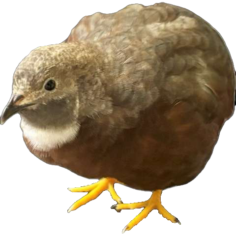
Outside of graphic design, I do digital illustration, consisting of original characters and existing characters in popular media. I started out with traditional media as far back as 2017 and transfered to digital platforms in 2021. It wasn't until 2022, however, that I began to take art seriously and learn basic principles. color theory, perspective, anatomy, and more. I've improved greatly since then, but I'm still learning so much, and I continue to improve my craft today.This is a skill that I'm proud of showing, not just for my proficiency in illustrating, but because illustrating is a passion that I've had for much longer than graphic design. I hope that in the future, when I solidify my graphic design style, I'm able to incorporate more of my illustrations to create an identity unique to me.I use the program Clip Studio Paint to create my illustrations, but I have also used programs such as Krita and Ibis-Paint X. For most of my projects, I work with 150 DPI, unless the project calls for printing. I work on a 300 DPI canvas for print projects.
SkillsDigital Illustration
Character Design
Character Illustration
Year2025 - Present


*create a small graphic here matching each project?

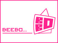
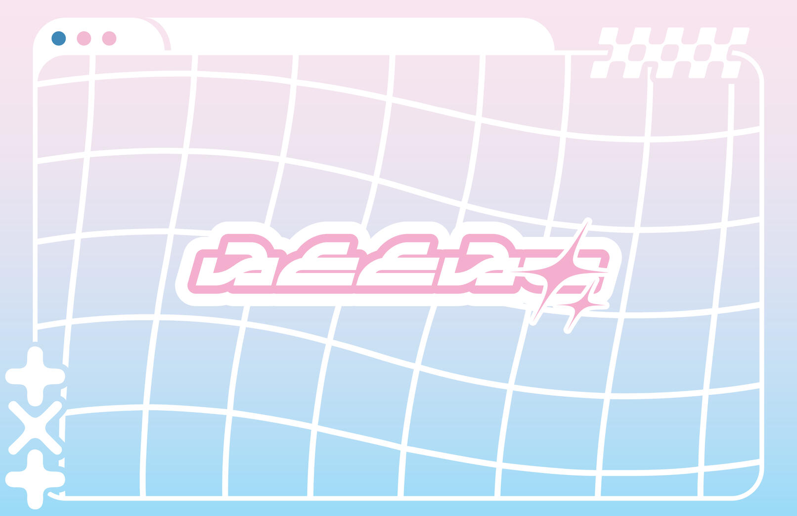
BEEBO Pop-Up Display
The goal of this project was to create a display stand for either an existing project made prior in the semester, or for an entirely new mock-up product. I chose to create something new for this final project — I wanted to create a line of gacha blind boxes featuring a small robotic character alongside a display stand inspired by japanese crane games, all with a Y2K inspired design to stand out from other blind box designs.I wanted to showcase both my illustrative skills and graphic design skills not just to create a successful design, but also to create something in a style I've always appreciated and loved, but never had the chance to.I used both physical and digital applications to complete this project: Clip Studio Paint was used to create the illustrations and box design and Adobe Illustrator was used to create assets and dielines. The use of matte paper, paper board, and spray adhesive were used to create the physical boxes. The use of matte paper was also used for the display stand, and alongside that was foam core, hot glue, and acrylic sheets.
SkillsDigital Illustration
Graphic Design
Packaging Design
Physical Mockups
Adobe Illustrator
YearFall 2025
Final Product


Initial Ideas, Sketches, & More


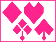
Playing Card Project
The original goal of this project was to create designs for playing cards based on brand archetypes, while also exploring the relationship of text and image to challenge the norm. The designs for the face cards would take on the image, while the number cards would take on the type.Reworking this project to truly make it my own, I wanted to design a total of 17 different cards. On top of that, I would adjust the layout of the cards to make more room for the card design, limit myself to a red/black/white color palette, create a backside, and redesign my previous designs to better fit the new vision for this project. I’ve also taken this as an opportunity to showcase my digital illustration skills rather than to stick to the original goal of the project.I used digital applications to design the cards: I used Clip Studio Paint to do most of the card designs, and worked on a 2.5”x3.5” 300DPI canvas. I used Adobe Illustrator to create the layout of all 54 cards and to arrange the art onto the cards.
SkillsDigital Illustration
Graphic Design
Physical Mockups(?)
Adobe Illustrator
YearSpring 2026
Final Card Art


Initial Layout & Sketches


BOUNTY Type
The goal of this project was to design and create an abecedary with a unique and memorable design. To expand upon the original 26 letters that were designed, numbers 0-9 alongside various other symbols, were designed to create a complete and cohesive typeface.I used multiple digital applications to design the typeface: Adobe Illustrator was used to create the characters and shape language, and FontForge was used to create a working typeable font in OTF format. Graphics to showcase the alphabet were created using Clip Studio Paint.
SkillsGraphic Design
Typography
Adobe Illustrator
YearFall 2025 - Spring 2026

Final Type Design


Initial Ideas & Sketches


FUBIESE Type
This personal project was an attempt to design an abecedary for a fictional language. This project was a challenge due to translating hand-drawn letters into vectorized symbols, creating cohesion throughout all 26 letters, making new characters with a unique identity, and separating them from the look of English characters.I used multiple digital applications to design the typeface: Adobe Illustrator was used to create the characters and shape language, and FontForge was used to create a working typeable font in OTF format.
SkillsGraphic Design
Typography
Adobe Illustrator
YearSpring 2026

Final Type Design


*insert graphics of typeface
Initial Ideas & Sketches

These are the original illustrations that the Fubiese typeface takes after. Rather than the rounded and organic shapes that the illustrations have, I took the creative liberties to condense and sharpen the look of the letterforms, as well as modifying some of the letters in the final product to create unity between all the letters, or because of the technical challenges I would have faced if I attempted to recreate the letterforms one-to-one.


Originally, I intended for the vectors to mimic the rounded shapes of the original illustrations, but after encountering technical issues—excessive points & anchors that were difficult to remove, difficulty replicating curves similar to the illustrations, atypical angles that made aligning shapes a struggle—I opted to go for an angular look to give the letterforms a sharpness that contrasts the original's rounded forms, while also staying faithful to the source material.
For a time, I skewed from the idea of angular & condensed letterforms, and instead experimented with wider letterforms with differences in thickness between strokes, similar to modern typefaces. Although this idea was short lived, some of the ideas from the sketch phase carried over, such as the shapes the letterforms hold, and the changed angle of the diagonal strokes.


